Target
warehouse modernization: fulfillment pick
01. About project
As a designer on the Maestro Supply Chain team, our main goal was to work together with product partners + engineers to help modernize existing technology and processes within Target’s “Middle Mile” supply chain space and all its warehouses. It is a continuous task, however an area where we had a big breakthrough was in the “Fulfillment Pick” space. Fulfillment pick is a process in the supply chain space that entails of online orders being released in the form of pick tasks and these pick tasks are organized in batches released in waves based on priority. Team members select pick tasks and navigate the fulfillment warehouse picking products to fulfill these orders.
The problem we were facing is the current fulfillment network employs a variety of costly/time consuming technologies and systems across different nodes which results in operational inefficiencies, and so they rely heavily on product teams and OSD process teams to solve these inefficiencies, leading to an inconsistent user experience for our team members. The lack of uniformity hampers our ability to streamline process and adapt to changing demands efficiently.
The goal for this product is to modernize these capabilities by utilizing existing target solutions and eliminate dependency on 3rd party software.
Role: Senior product designer
Tools Used: Target design system “My Day” for Maestro, Figma, Jira, Asana, Miro, Microsoft Office
02. User Research
For our user research, a small group of us on the design team traveled to warehouses to document the current picking process and other existing processes to gain a better understanding of the space. While at the warehouses, we interviewed a couple of team members, shadowed them during the picking process, took photos and videos, and gathered any information we could to help up understand areas of concern or how we could help alleviate any pain points for our team members.
Pick PROCESS goes like this:
Fulfillment pick kicks off when guests places an order online.
These orders turn into pick tasks which get released in batches. Leaders will break these batches into waves, release them throughout the day, always ensuring that work is happening based on wave priority. Waves then turn into pick tasks.
1.
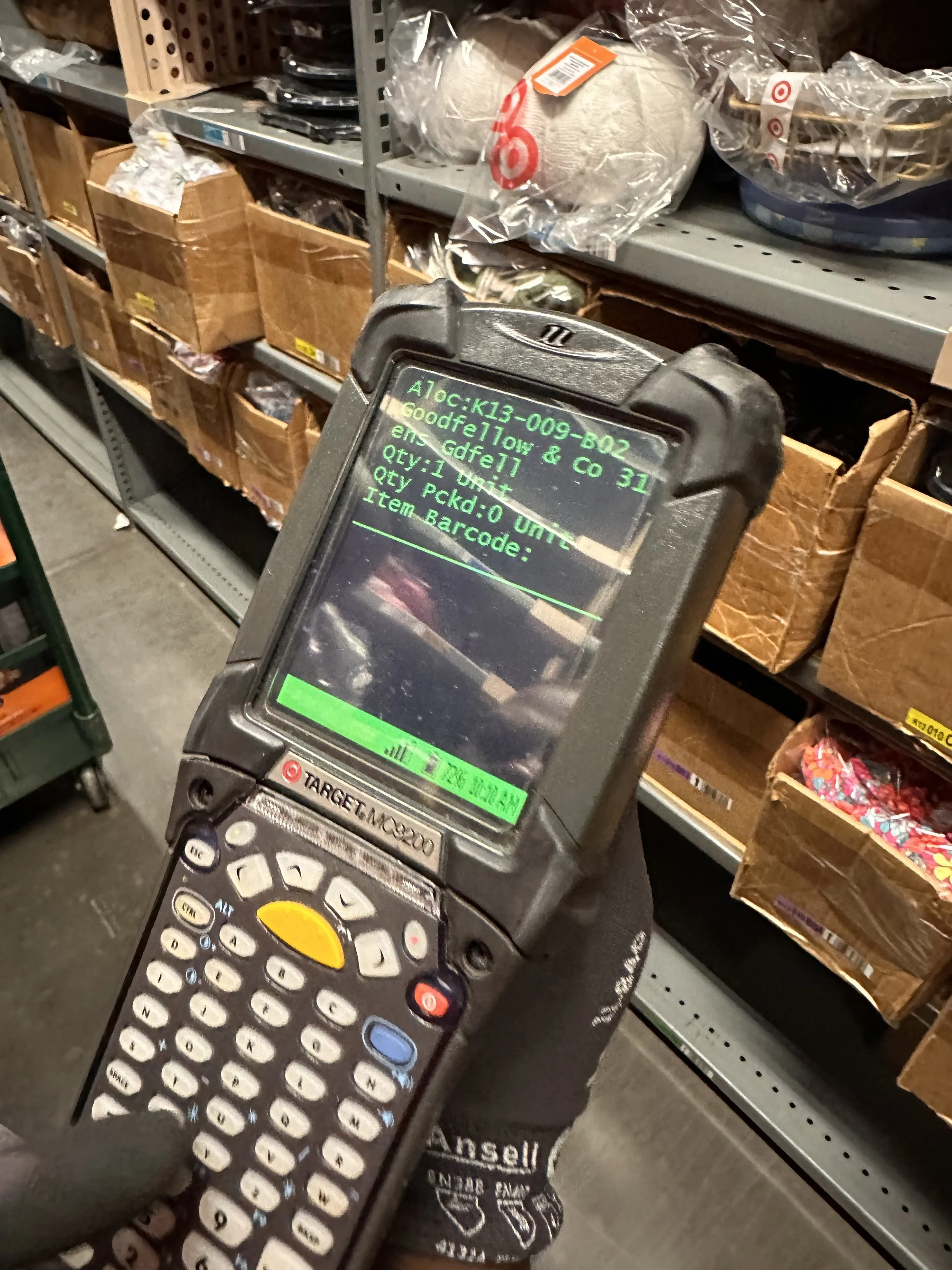
Picker selects available task, grabs available cart, preps the cart by placing totes within the cart, then scans the cart, and then goes to the first pick location within the warehouse indicated on the zebra device.
The screen on the device tells the pick what item to pick, by showing them the brand and item description, where to locate the item, and what bin the item is in.
When team member locates the item, they scan the item and then place it into cart. Team member keeps repeating this process until all items are picked or the cart is full.
2.
Once cart is full, the team member brings cart to takeaway conveyor area, scans the tote, places it on the conveyor, scans the conveyor (to systematically link tote to conveyor).
Tote then gets sent to Rebin or Pack, and the TM picks a new task. Process keeps repeating until all pick tasks are finished for the day.
3.
In Conclusion:
Team members like this process being straightforward because the device guides them every step of the process. However, old pick process imposes some pain points:
Outdated UI: doesn’t show team members what products look like or detailed descriptions. Having to rely on muscle memory to remember what items look like, brand name, or description because current system does not have images or breaks up the information well. This also causes issues with any product updates.
Relying on jump-codes: The UI will tell them if they've scanned the wrong item, but they then have to use jump codes to navigate within the system or perform any actions causing strain on mental load.
Memorizing navigation of aisles: they rely a lot on physical awareness to make sure they don't interrupt another team members pick flow or even where to find items - which can be a problem to newer team members.
No clear indication that the task is complete: Current system just takes them out of the flow with no notification indicating pick task is complete so team members have made a mental note of identifying that action as indicating they have picked all the items. However, if team member isn’t aware of this action, it will lead to confusion.
Productivity: TMs are measured on how many items they pick per day, so easing the user experience was a must in order to help them achieve their daily goals.
03. Definition & Ideation
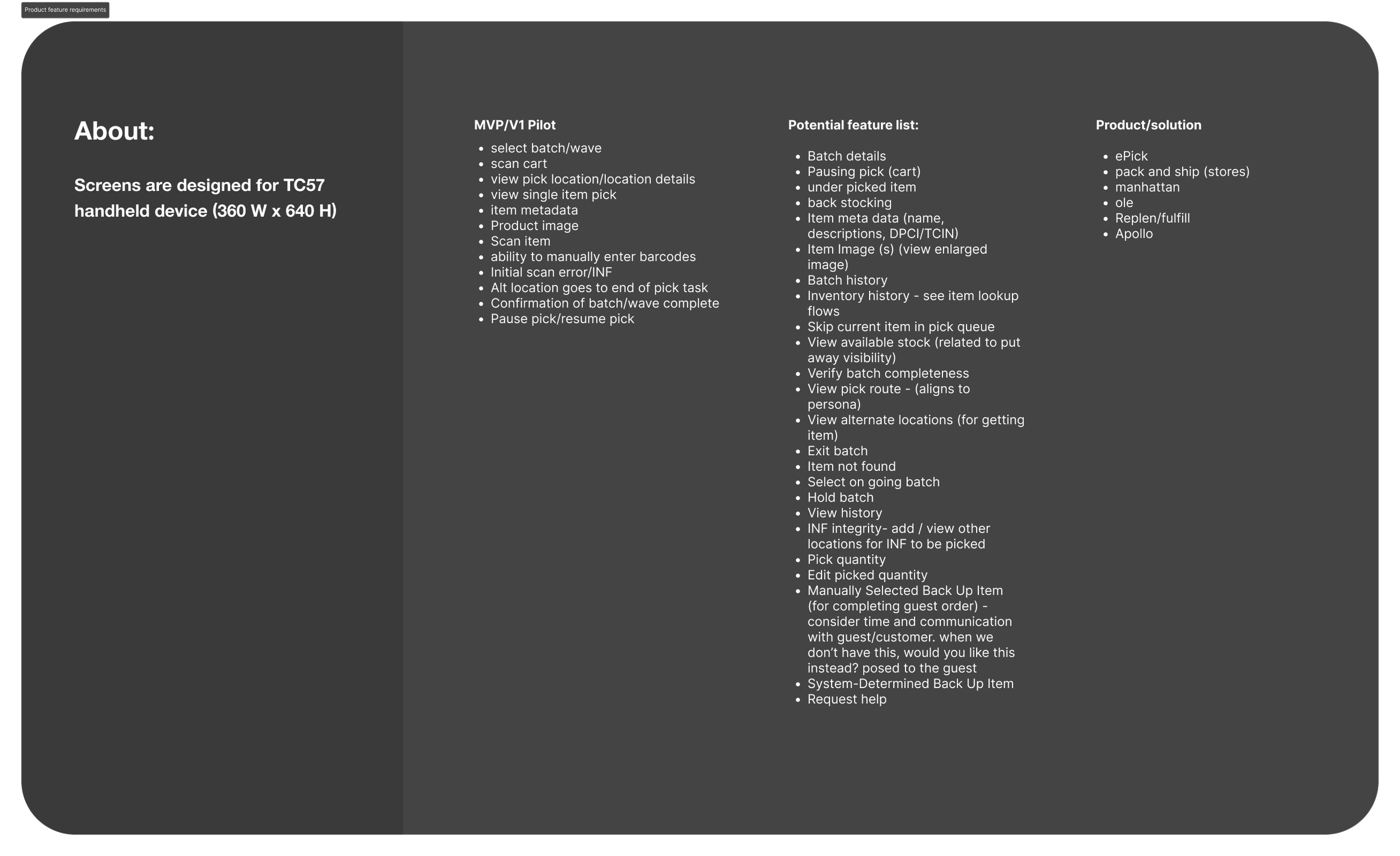
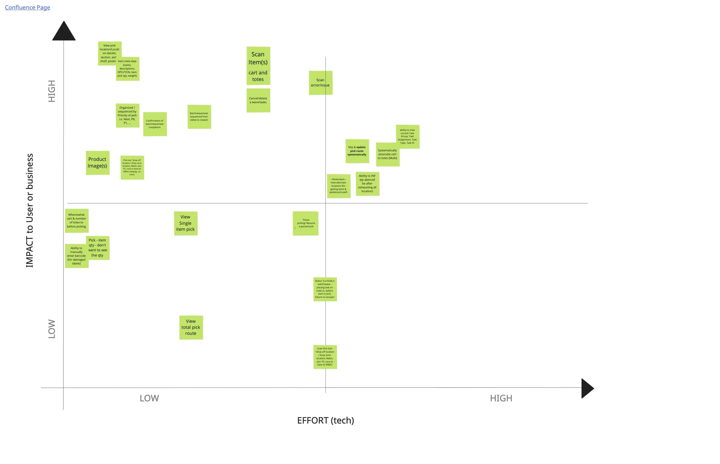
Product requirements:
As our first step in ideation, the product team + engineers met to discuss feature prioritization and product requirements. We discussed impact to users or business and how much effort would be required from tech. After our meeting, we met with stakeholders and leveraged their knowledge regarding pick processes to further narrow down our list of product requirements.
User flow:
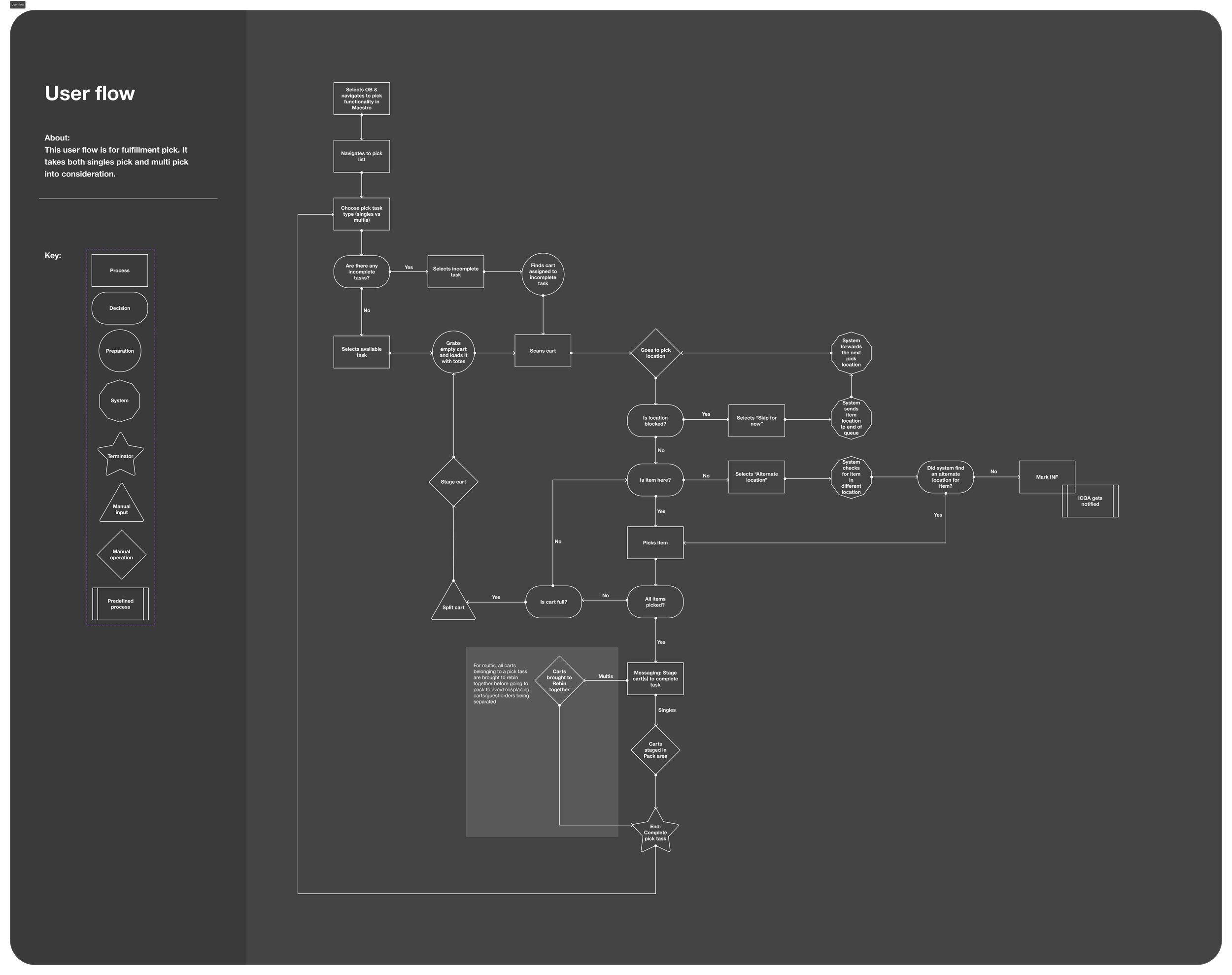
While leading the design of the Singles Pick user flow, I intentionally considered the broader fulfillment system, including the Multis Pick process. Although both flows share similar picking behaviors, Multis involves picking multiple items per order, while Singles focuses on one item per order—making it critical to clearly articulate where the experiences diverge.
I designed the user flow to explicitly surface decision points, user versus system actions, and manual versus guided steps. This systems-level mapping created shared clarity across product, design, and engineering, and established a strong foundation for a future Multis Pick redesign. Ultimately, this work helped the team define what a guided enterprise workflow could look like and supported the development of our proof of concept.
Ideation:
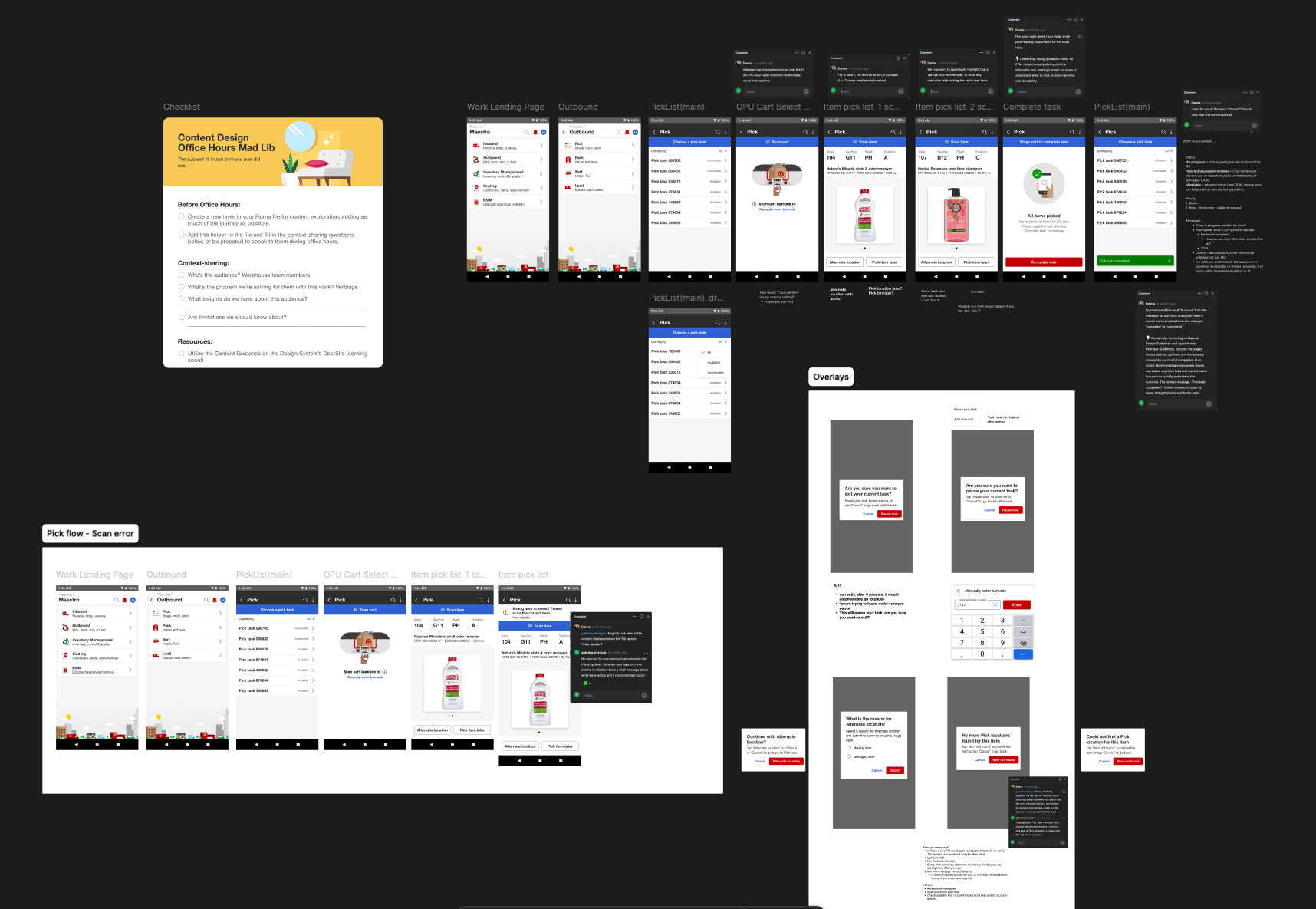
During ideation, I collaborated closely with Target’s content team to ensure consistency between design and content. This partnership was critical in shaping a complex flow with many exception paths, helping the team reach a clearer, shared understanding of functionality and user actions. This was crucial in bridging the gap between Target’s SASC/MyDay design system and keeping user-centered designs.
User testing
I led six user testing on our prototype while the product research team captured insights and feedback. Participants represented a range of roles within the pick workspace, including two leaders and four team members, allowing us to gather perspectives from across the workflow. Our focus became to identify usability issues, inefficiencies, and discover opportunities in order to maintain positive user experience and learn about our users. For our testing, we had users complete the pick task within the system by assigning them tasks and scenarios
testing:
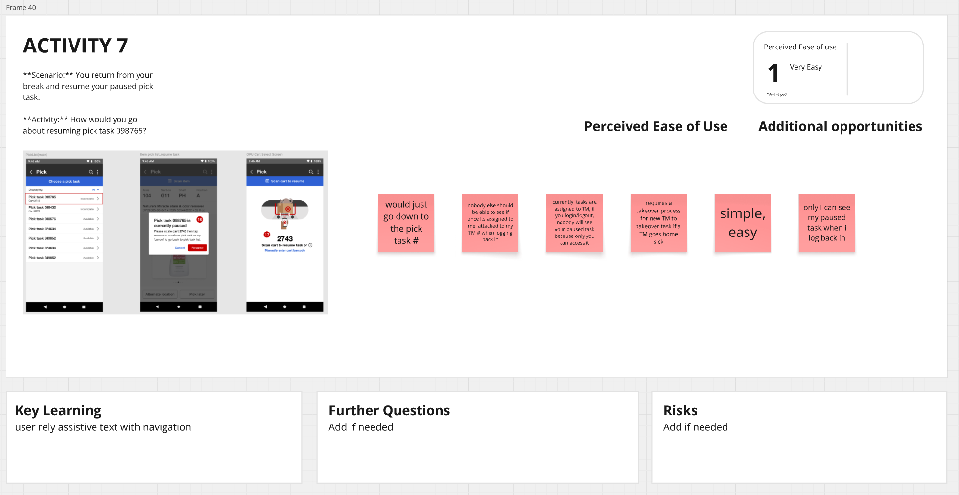
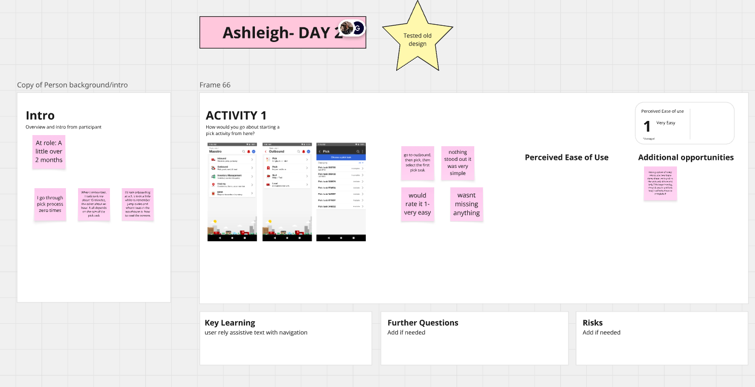
Users completed key workflows including scanning carts, picking tasks, using alternate locations, and staging carts using our prototype. Each participant tested a unique scenario, documented on an individual board.
We captured first impressions, usability issues, expectations, and opportunities, followed by a final feedback discussion after each session.
Testing early helped us identify patterns, surface pain points, and iterate on designs ahead of the pilot—demonstrating the value of involving team members early in development.
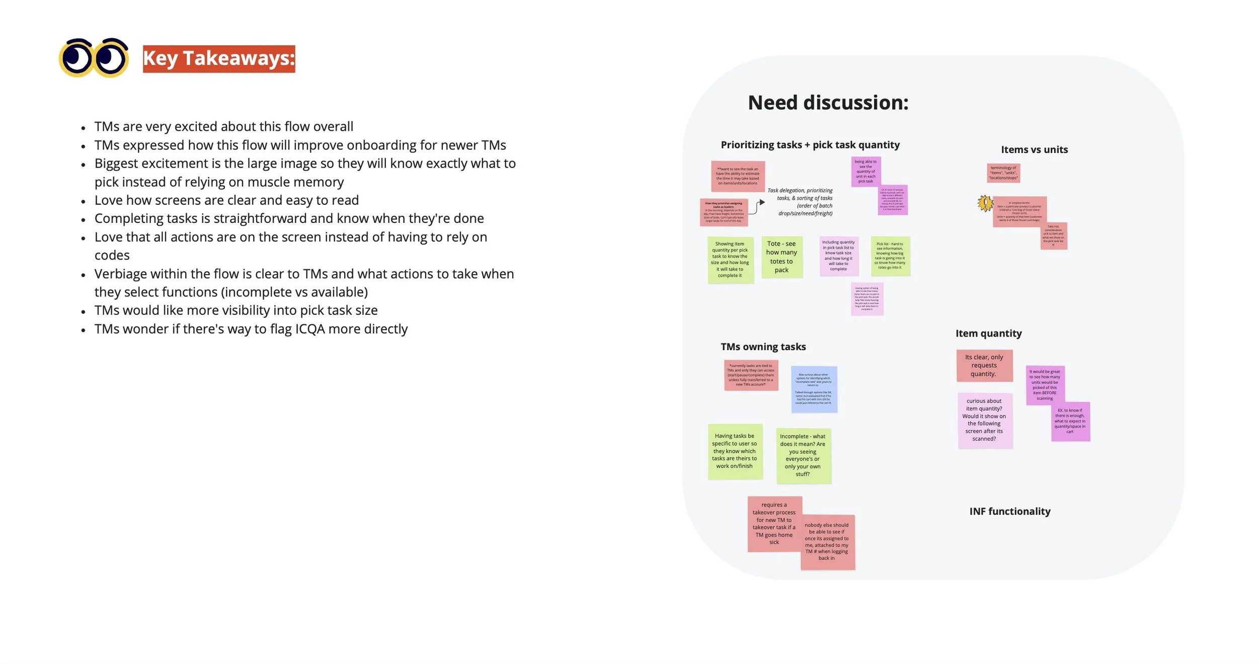
insights + key takeaways:
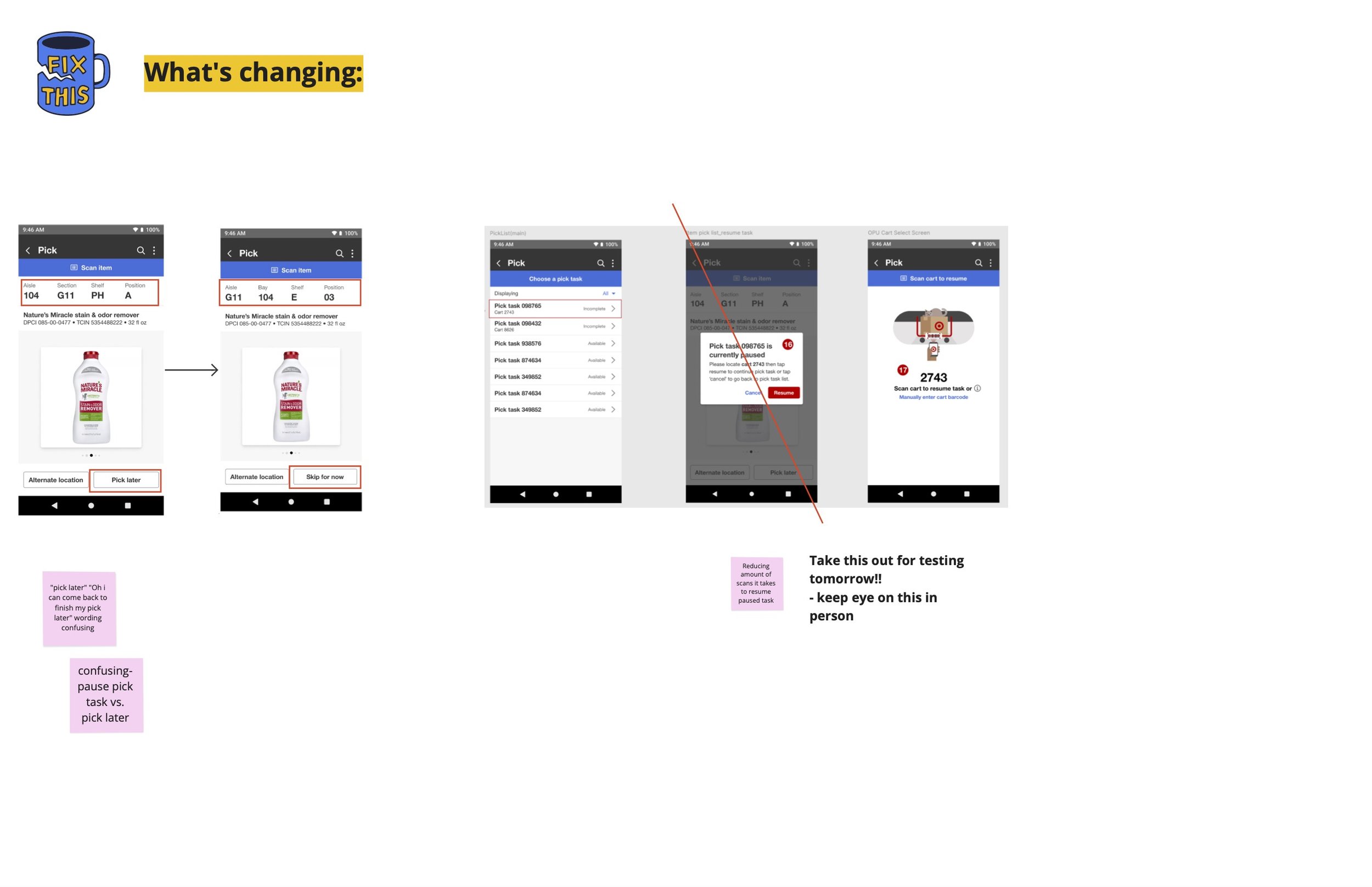
After wrapping up testing, we consolidated key insights and flagged areas to monitor during our in-person visit. Team members responded enthusiastically to the flow, noting its clarity, large imagery, and intuitive on-screen actions.
Some of the feedback we received was how easy the screens and straightforward the flow was, especially having big images and all of the functionality on the screens instead of relying on jump codes to perform any actions, actually having a screen dedicated to completing a task, which team members did not have before.
That enthusiasm continued when we visited in person—especially from participants who had taken part in usability testing and were already familiar with the experience and excited to try it live.
pilot
New pick experience:

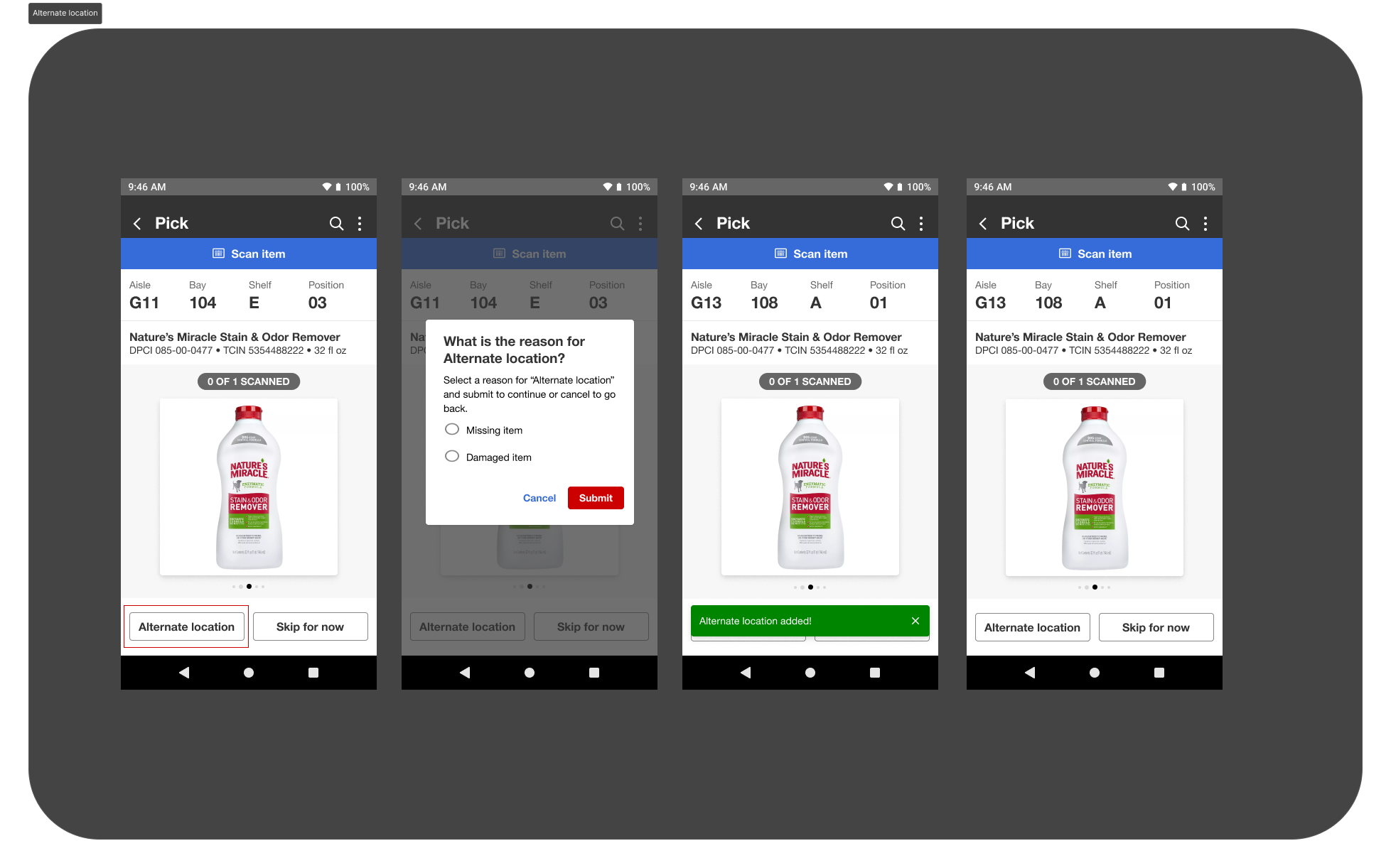
Alternate location
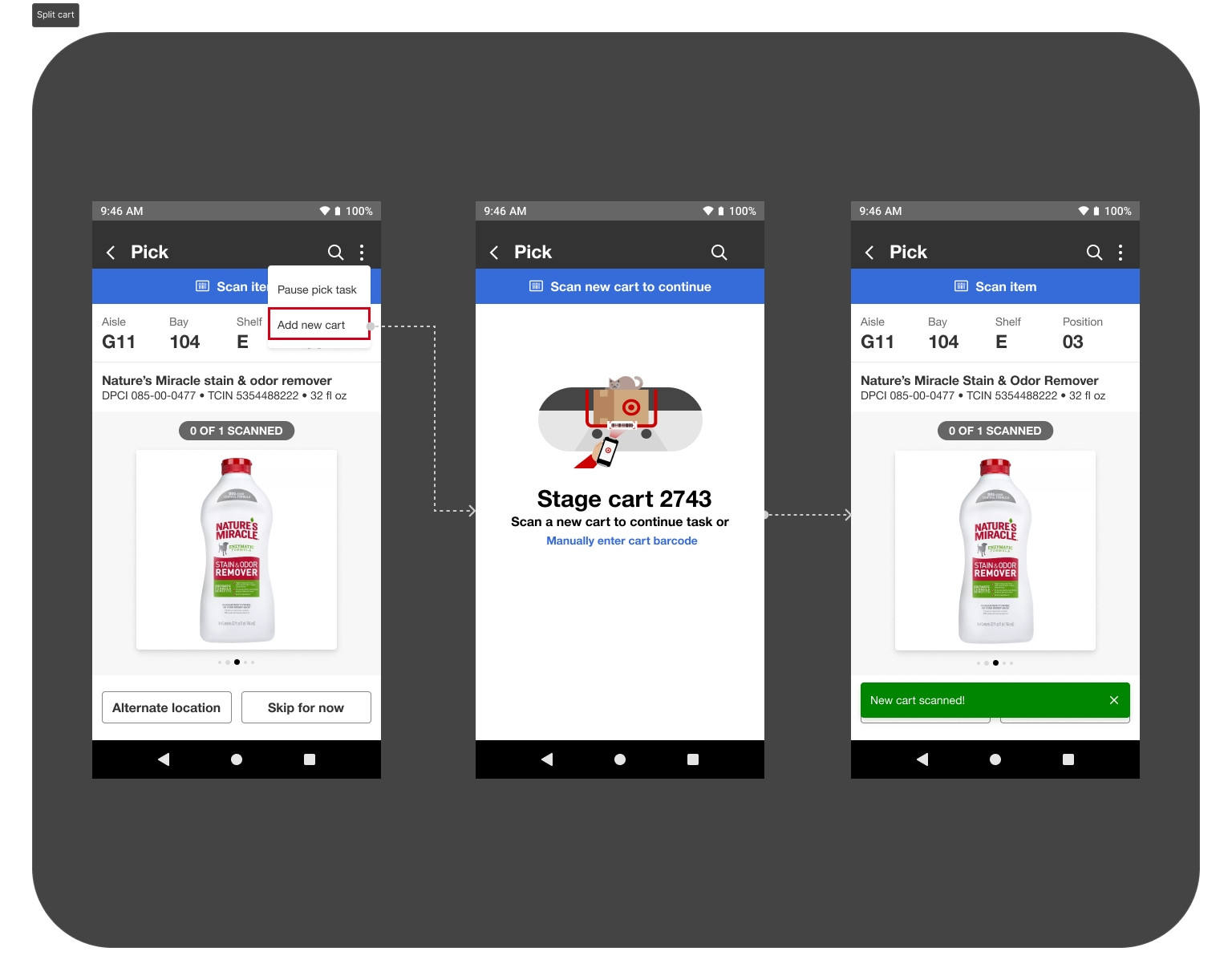
Split cart
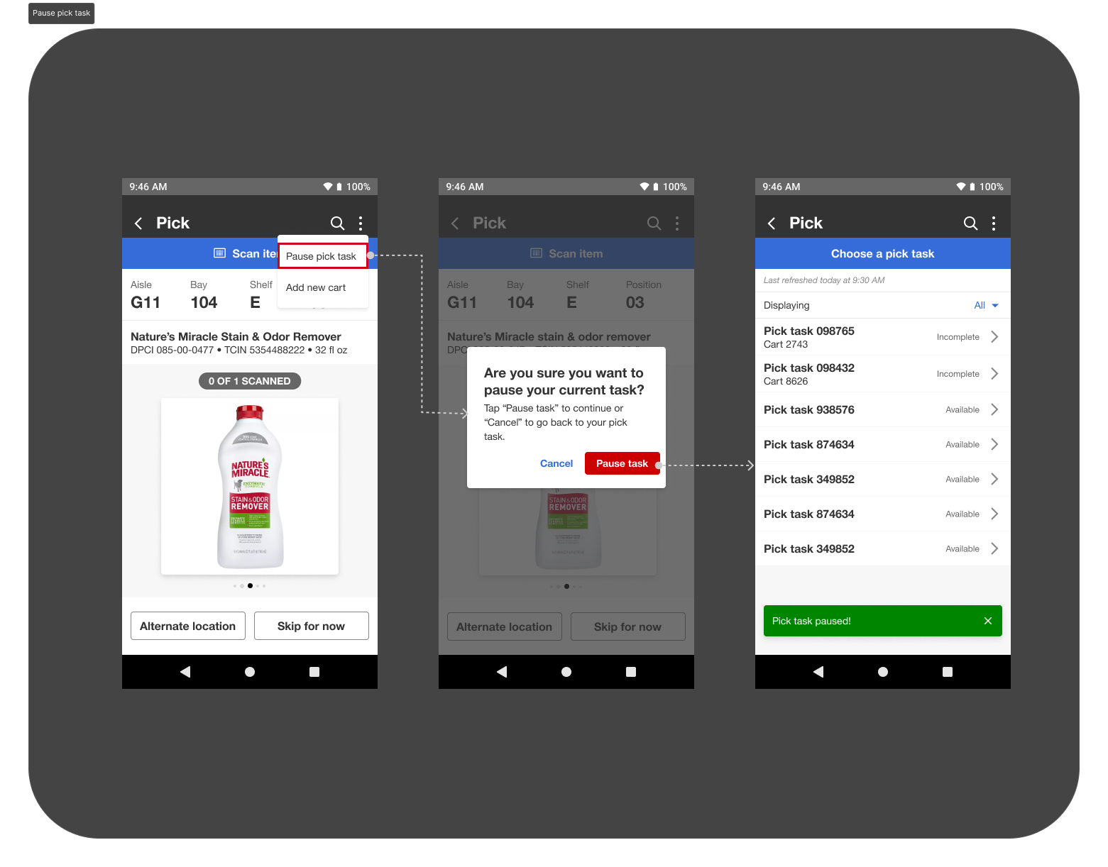
Pause pick task
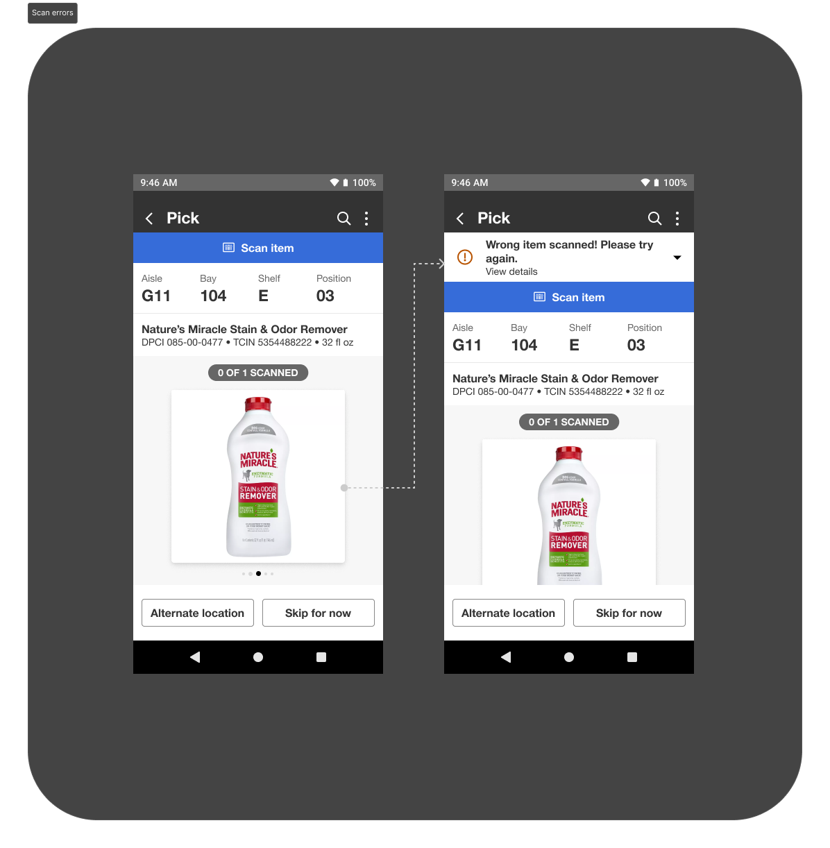
Scan errors
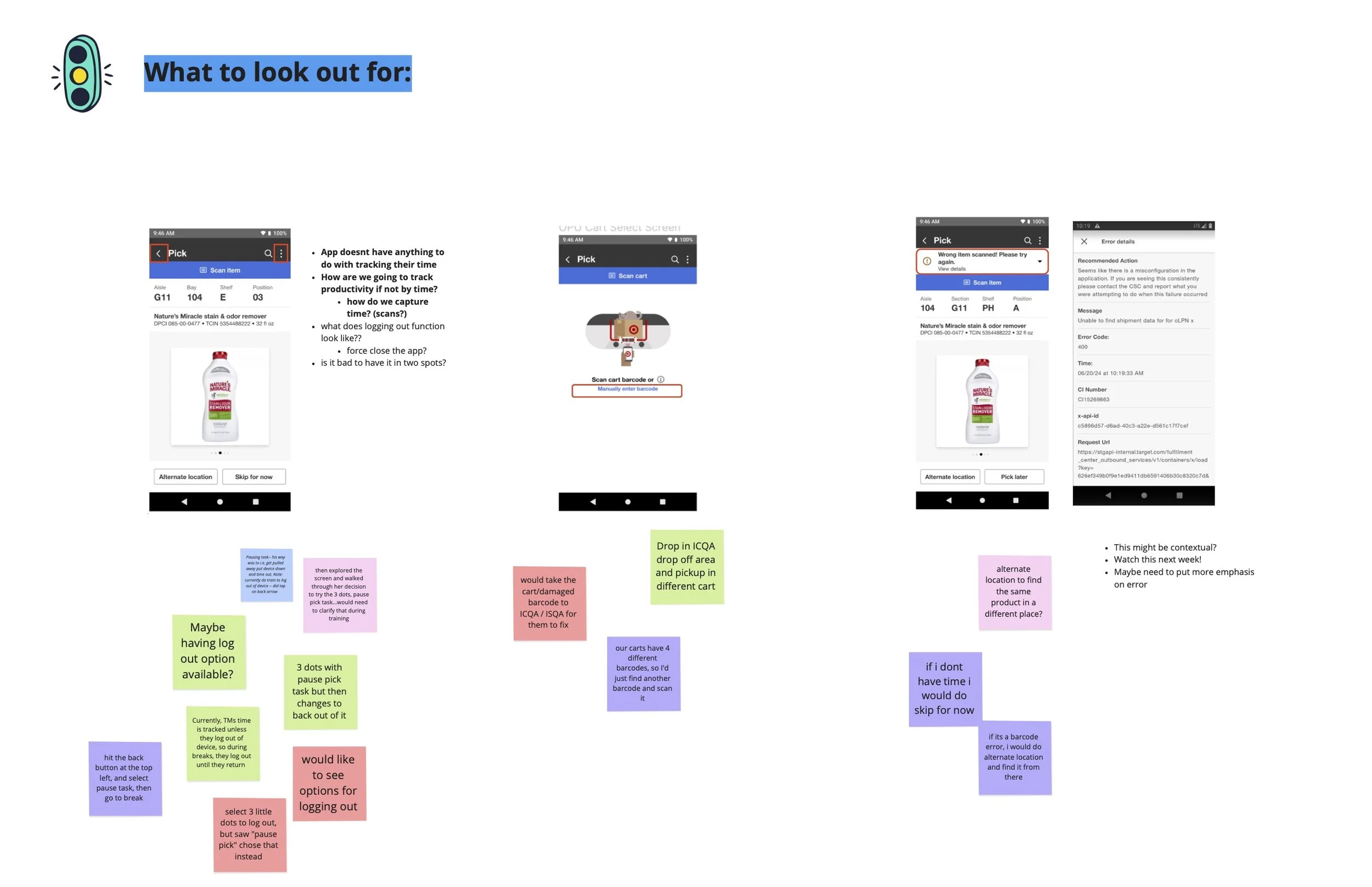
Shadowing team members:
For the pilot, I helped ensure cross-functional representation on site, with members from each team present so we could divide and conquer research efforts. This allowed us to observe multiple aspects of the product in real time and gather well-rounded insights during the visit.
On the front end, we shadowed team members as they picked items to validate functionality and usability, with a focus on the key workflows highlighted in the designs. We also documented team members using both the legacy system and the new experience to understand which existing behaviors and features were already working well and how they could be incorporated into the redesigned flow.
In addition, we observed how team members naturally troubleshot issues and evaluated their physical environment during picking. These observations helped us assess how well the new designs performed in real-world conditions and informed further refinements.
key takeaways
The pilot strongly validated the new designs, with team members successfully picking 355 units and responding positively to the overall experience. Early user involvement and proactive planning for exception paths resulted in feedback focused on minor refinements rather than core usability issues.
Several key UX decisions were validated in the field, including the addition of an item quantity component—initially challenged by partners but ultimately identified by team members as a critical need and incorporated into the final designs. Partner feedback underscored the value of UX presence on-site, noting that important experience details would have been missed otherwise.
Most importantly, team members reported increased confidence using the new UI, with early signals of improved picking speed—directly supporting productivity goals. Early collaboration between UX, partners, and team members ultimately led to a successful pilot and a scalable, real-world-validated enterprise experience, which allowed for a quick turn-around and successful product release which is currently being used across several warehouses today .
Next steps:
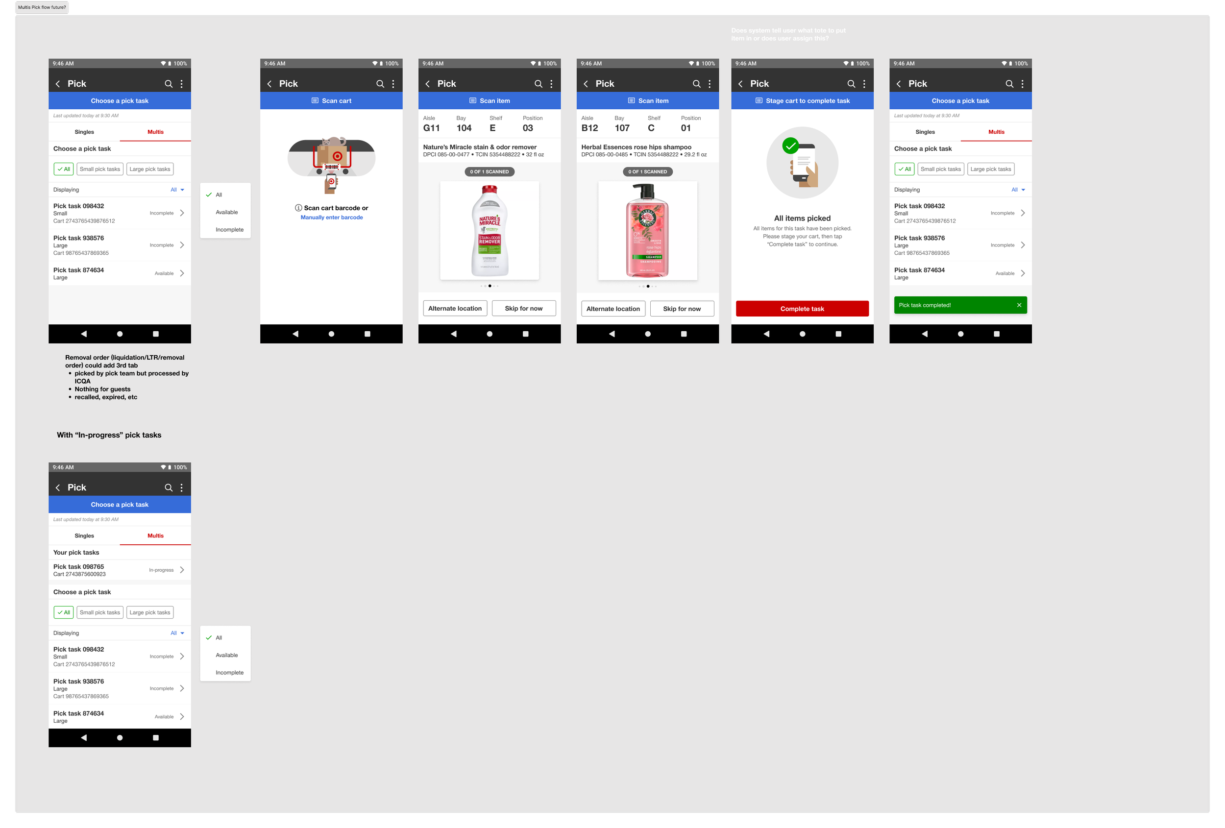
After the successful launch of Singles Pick, I led the rapid transition into the Multis Pick flow. Early systems-level planning and upfront research enabled the team to move quickly from user flow definition into design and feedback.
The Multis experience launched three months later and is now in use across multiple warehouses